CLIENT
PROJECT
DESIGN SYSTEM
SUMMARY
This case study highlights the design system I developed for Cancer Research UK (CRUK) to enhance the accessibility and flexibility of their Donate Thin Slice, a key section of the site responsible for driving donations. As the lead designer, I worked to create a scalable, intuitive system that aligned with CRUK's new brand guidelines while supporting content creators’ needs.
RESPONSIBILITIES
UX Design Lead
BUILDING A FOUNDATION FOR ACCESSIBLE DONATIONS
Cancer Research UK (CRUK) is the world’s largest independent funder of cancer research, with a mission to bring forward the day when all cancers are cured. As a leading charity, CRUK’s website serves millions of visitors, from those seeking information about cancer research to donors making contributions. With a new brand refresh, CRUK needed a comprehensive and flexible design system to ensure consistency across their digital platform. The primary focus was on creating a fully accessible Donate Thin Slice, which would serve as the core component of their website’s donation experience, vital for supporting the charity’s mission to fund life-saving research.
This Donate Thin Slice would act as the foundation for future design components across other key areas of the website, including research, charity events, and donor engagement. The challenge was to build a design system that was both intuitive for users and easy to manage for content editors, while meeting WCAG accessibility standards.
THE PROBLEM
TRANSFORMING CRUK’S DONATIONS: SCALABLE, ACCESSIBLE & ON-BRAND
CRUK's existing website lacked a cohesive and scalable design system. The Donate Thin Slice, a key part of the site that facilitates donations, was not sufficiently aligned with the brand's updated guidelines, and the lack of a unified system hindered usability and accessibility.
The core challenge was creating a flexible, intuitive, and accessible design solution for this part of the site while ensuring it met the needs of content editors and complied with WCAG accessibility standards. The system also needed to be scalable, allowing it to grow with the site as new sections were added.
THE PROCESS
LISTENING TO THE VOICES THAT MATTER
I began the project with an in-depth analysis of CRUK's brand guidelines and the specific needs of its target audience. This included reviewing the current state of the site to understand the pain points and opportunities for improvement. In parallel, I conducted a detailed review of WCAG accessibility standards to ensure that the new design system would be fully compliant.
This research phase was essential to understanding the user base, which included both donors and content editors and to identifying key requirements for a system that would support both accessibility and usability.
DONATE THIN SLICE AUDIT
A key first step was performing a comprehensive audit of CRUK’s existing Donate section. The audit allowed me to identify:
Which components were working well and which were outdated
The gaps in functionality and design that needed to be addressed
Potential improvements for accessibility and user experience
This audit not only highlighted the scale of work required for the Donate Thin Slice, but also provided a roadmap for the components that would need to be built or refined. It was crucial to prioritize the components that would have the biggest impact on the user experience and content management workflows.
ATOMIC DESIGN METHODOLOGY
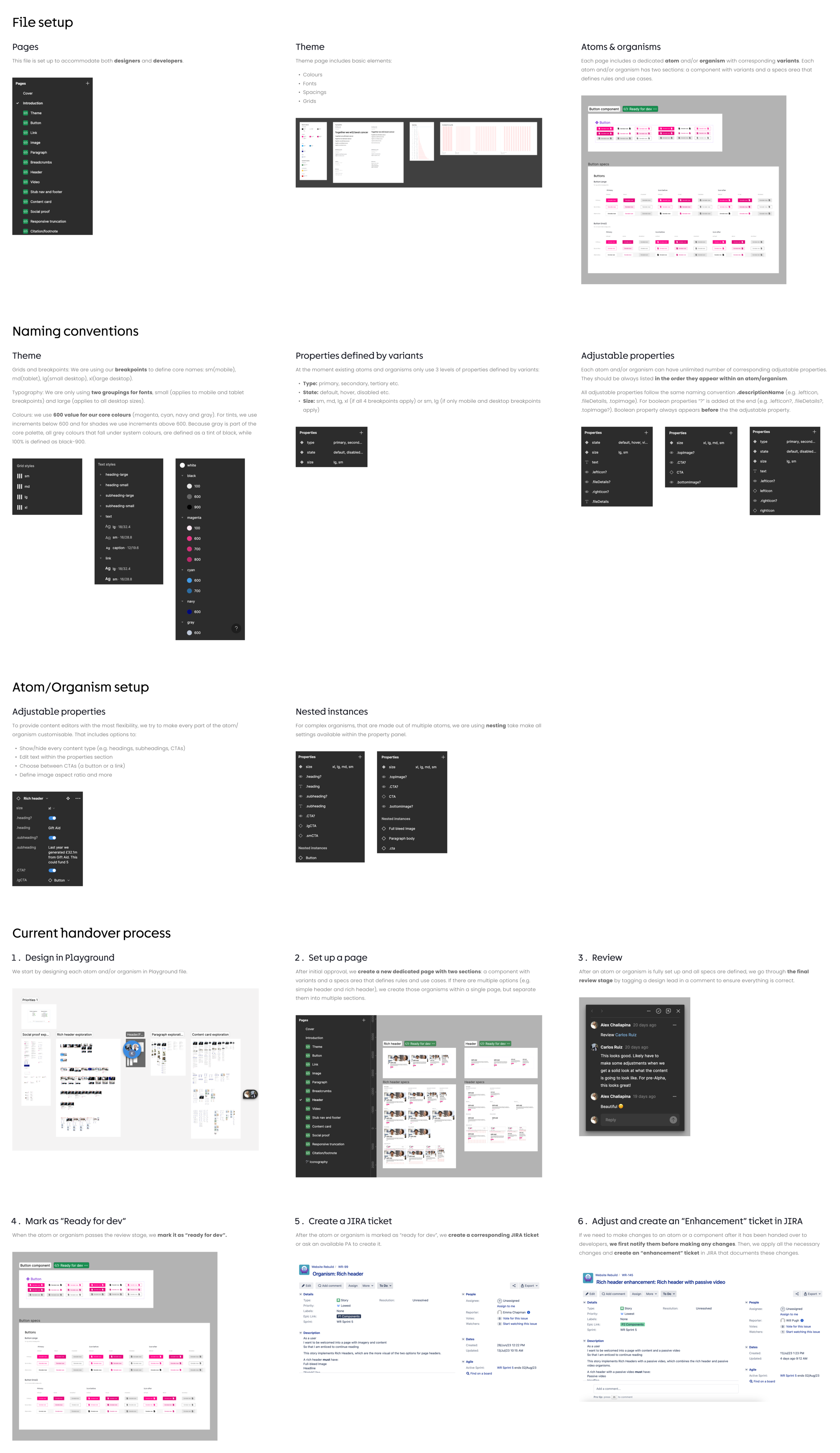
To ensure scalability and consistency, I adopted the atomic design methodology, which breaks down the design into multiple levels:
Atoms: Basic elements like buttons, form fields, and text styles
Molecules: Combinations of atoms that form more functional units, such as input fields with labels and buttons
Organisms: Larger, reusable components such as donation forms or user registration blocks
Working closely with the content modelling team, we identified the essential components needed for the Donate Thin Slice and began building out each level, from atoms to organisms. This methodology allowed us to create a system that was modular, flexible, and reusable across the website.
DEFINING THE CORE THEME
One of the first steps in the design process was to define the core theme, which included the foundational elements of the design system: colors, grids, spacings, and text styles. A major challenge emerged when I found that CRUK’s signature magenta did not pass the WCAG AA contrast ratio standards. To address this, I developed an alternative shade of magenta that passed accessibility tests while staying true to the brand’s visual identity. This new color was used for key elements, including buttons, links, and atoms, ensuring that the design adhered to accessibility requirements without compromising the brand’s look and feel.
DESIGN SYSTEM DEVELOPMENT
With the core theme defined, I began developing the design system, starting with the foundational atoms and molecules and gradually progressing to full organisms. Each component was designed with flexibility in mind to ensure it could adapt to different breakpoints and device sizes.
Testing was an integral part of the process. To ensure the system was practical for content editors, I worked closely with the team to understand their content management workflows and ensured that the system would be easy to implement and maintain.
PROTOTYPING & TESTING WITH CONTENT CREATORS
Once the initial components were ready, I began prototyping and testing them with the CRUK content editors. The goal was to validate the usability of the components from the content editors’ perspective. It was also important to ensure the components were flexible and easy to update within the content management system (CMS).
I collaborated with the editorial team in Figma, creating mockups together and receiving real-time feedback to refine the components. This close collaboration was crucial to ensure that the design system would be both functional and user-friendly for CRUK’s team.
ENHANCING COMPONENTS BASED ON FEEDBACK
Following the testing phase, I incorporated feedback from the content editors and made necessary refinements to the components. This iterative process helped improve both the design and functionality of the system. Once the components were finalized and approved, they were handed off to the development team for implementation.
This collaborative, iterative approach ensured that the design system was practical, accessible, and fully aligned with CRUK’s needs.
THE RESULT
A FLEXIBLE DESIGN SYSTEM BUILT FOR THE FUTURE
While the initial focus was on the Donate Thin Slice, the design system provides a solid foundation for future expansion across CRUK’s website. The modular, flexible design approach ensures that the system can scale as new sections are added, such as research, charity events, and more.
As the design system continues to evolve, it will support a more cohesive and accessible experience for all users, reinforcing CRUK’s commitment to providing an inclusive, user-friendly platform for donors and content editors alike.
THE IMPACT
BOOSTING DONATIONS, STREAMLINING WORKFLOWS
The new Donate Thin Slice design system has already made a measurable impact:
15% reduction in abandonment rates: By streamlining the donation flow and ensuring accessibility, users are more likely to complete their donation.
Faster content updates: Content editors can now manage donation pages more efficiently, reducing the time spent updating content and improving overall workflow.
KEY TAKEAWAYS
FLEXIBILITY, COLLABORATION & ACCESSIBILITY
Importance of Flexibility
Designing for scalability was one of the main priorities. By focusing on atomic design principles and modular components, I created a flexible system that can grow with CRUK’s evolving needs. This approach also enabled easier updates and improvements over time.
Collaboration Drives Success
Continuous collaboration with content editors was vital. By testing components early and often in Figma, I ensured the designs were not only aligned with CRUK’s brand but also practical for those using them. Their feedback helped refine the system and align it closely with user needs.
Accessibility as a Non-Negotiable
Making accessibility a top priority from the start was essential for ensuring compliance with WCAG guidelines. Addressing color contrast issues early on, for example, helped maintain a visually appealing design while making it accessible to all users, particularly those with visual impairments.
Iterative Refinement is Key
Design is rarely perfect on the first pass. Through iterations, testing, and refining components, I was able to continuously improve the system, ensuring it met the needs of both the business and its users. Flexibility in the design process allowed for adjustments based on real-world feedback.
FINAL THOUGHTS
TRANSFORMING THE PROCESS
This project was an exciting opportunity to create a design system that not only improved the user experience but also contributed to a cause that has the potential to change lives.
By focusing on accessibility, flexibility, and collaboration, I´ve helped set a solid foundation for CRUK’s digital presence to grow and evolve alongside its mission. The design system will continue to expand beyond the Donate Thin Slice, ensuring that the platform remains user-centered, scalable, and capable of delivering a seamless experience as more sections and functionalities are added to the website.
Ultimately, this work will help CRUK engage more donors, streamline content creation, and support the ongoing fight against cancer.


